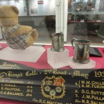
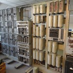

See also this blogpost – and the photos above. Continue reading “Bletchley Park: where government started computing”
Journalist, editor, analyst and trainer on computing, government, climate and data

The wartime codebreaking centre is preserving the British government’s leading role in creating and developing electronic computers
See also this blogpost – and the photos above. Continue reading “Bletchley Park: where government started computing”
Parisian museums have a lot of mentions of ’email’, but usually that is because it is French for the enamel of which an exhibit is made. But the excellent Musée de l’Armée within Les Invalides has an exhibit showing an earlier kind of paperless communication: v-mail. Continue reading “Did v-mail lead to email?”
The data used in the Guardian article quoted from below, on how life expectancy varies across the country, deserved mapping. I’ve focused on UK male life expectancy, which according to the Office of National Statistics varies by 13.3 years between Glasgow (71.1 years) and Kensington and Chelsea (84.4 years).
Map removed as Google Fusion Tables no longer works.
Red pointers represent male life expectancy of less than 75; pink from 75 up to 77; yellow from 77 up to 79; green from 79 up to 81; and blue 81 and over.
If you click on a pointer, you can find out how much longer men in that area can expect to live than Glaswegians, and how much less than residents of Kensington and Chelsea (and tweet it if you wish). Female life expectancy is also included. Continue reading “UK male life expectancy mapped, from Glasgow to Kensington”
UK-wide online system letting patients see results within hours of a test may be used by other specialities
This is an unusual example of a system built by a couple of NHS organisations in one nation – health boards in Scotland in this case – which is then adopted by units across the UK. Continue reading “Open source test results service adopted by renal patients”
The Hospice Comtesse, just north of the historic centre of Lille, opened in 1245, more than seven centuries before the formation of the NHS. It treated the sick for free, using income from its estates and donors, until 1796 when post-revolution reforms turned it into a hospice, a role it performed until 1939. As a tour of the buildings, now a museum, makes obvious, it was an explicitly Christian institution, with a chapel adjoining its huge dormitory ward and its healthcare provided by nuns. Continue reading “Religion and healthcare: why the NHS provokes holy arguments”