
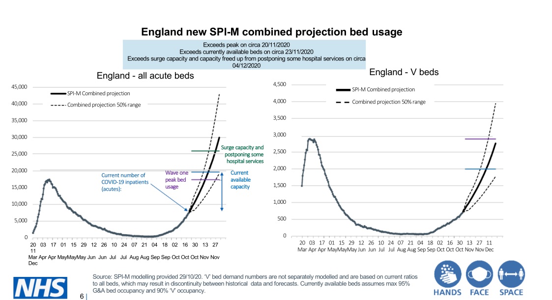
The government’s Halloween press conference was an obvious example to use in my article for Computer Weekly on the good, bad and ugly of data visualisation during the pandemic. Before one slide headed ‘England new SPI-M combined projection bed usage’, chief scientific adviser Sir Patrick Vallance actually said “this is a complicated slide”. No argument there (see below). Professor Chris Whitty charged through 10 slides in under seven minutes.
Rob Fry, head of data visualisation at the Office for National Statistics, tells ONS staff to pick a key message then design graphs around that: “You’ll avoid the temptation of trying to cram too much into the chart,” he told me. Fry was talking about how the ONS works rather than criticising anyone else, but his advice could usefully be taken elsewhere in government.
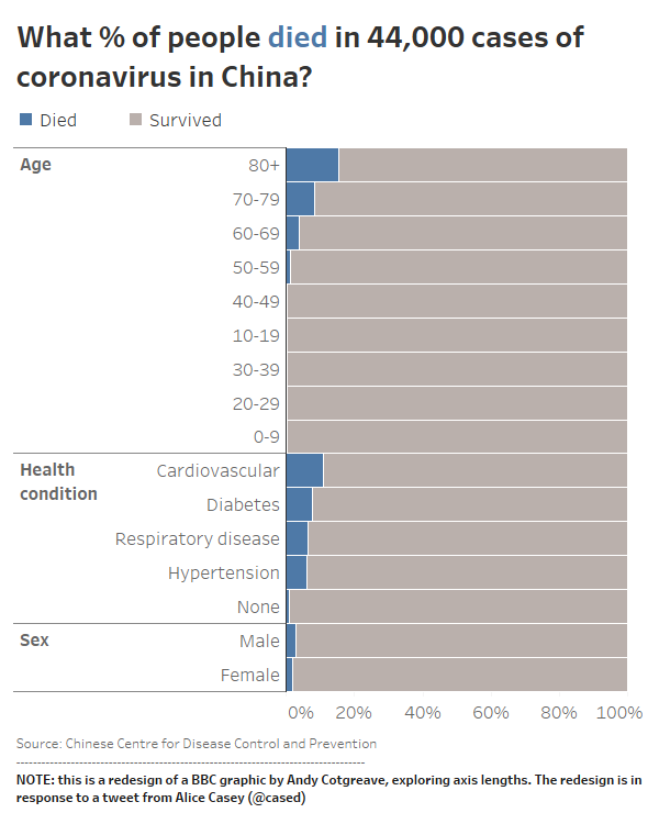
In some cases, data visualisations miss things they should include. Andy Cotgreave at Tableau redesigned a BBC chart produced near the start of the pandemic, which gave the impression that anyone over-80 catching Covid-19 was as good as dead by ending its x-axis at 15%. Cotgreave’s version (below) included the survivors.
Editing involves deciding what is and isn’t important, and graphics need editing at least as much as words do.