If you run a website of any nature, you are likely to look at your web statistics and wonder about what interests people. I have been looking at the data for the six months since I started this blog, and can provide some insights. Turns out people like a teddy bear, but we’ll get to that.
The most popular post so far has been my map of male life expectancy by local authority, with 8.5% of total page views. It exposes local patterns, such as Clydeside’s terrible health; it actually has something to do with my job; it lacks the ‘United Kingdom’ label that Google recently added to its maps (after it told me how to remove this); and it has a lot to say about how dramatically life chances vary depending on where you live. The last point is true of the map of where Oxbridge applicants come from, which has produced 4.7% of traffic.
However, the Oxbridge map is beaten by two other posts. In third place is an article I wrote a decade ago for technology magazine T3 on what were then Virgin Trains’ new Pendolinos. I used to have this on the old version of my website, and have redirected the old URL, but otherwise it’s buried within the site – and yet it gets 5.8% of page views. Traffic for new posts generally comes through Twitter, but people find the Pendolino article through Google. As of now, it is top for a Google UK search on ‘What controls Pendolino track tilt’ (a question it answers), second for ‘Pendolino train engines’ (which it covers) and top for ‘British Rail Pendolino cost’ – which it also answers (£1bn), although British Rail didn’t pay it as trains had been privatised by then. Anyway, it’s good to help people with their train-related questions.
In second place, providing 6% of traffic, is a gallery which accompanied an article based on my visit to Bletchley Park and the National Museum of Computing. The larger versions of each image have attracted a further 4.1%, so altogether this post has generated the most page views – helped by linking and retweeting by supporters of the museum and of computing pioneer Alan Turing.
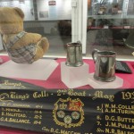
 Of the four images in the gallery, the clear winner on traffic is the picture of Alan Turing’s teddy bear Porgy (top of Google for a search on those five words, and actually on display in Bletchley Park’s main museum, rather than the computing museum). But in an attempt to get two things into one photo (Porgy and a blade showing Turing’s place on a King’s College rowing team) I made the bear appear rather shy.

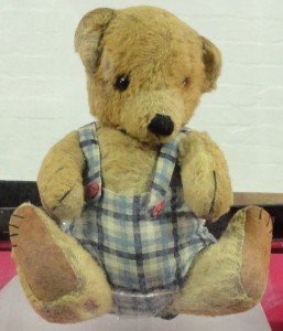
To remedy that, this post brings you face to face with Porgy (with a larger version here). According to the museum’s exhibit label, Turing bought this Chad Valley Co Ltd bear as an adult, and practiced his lectures in front of him. One Christmas, his five-year-old niece Shuna Turing received a skirt with braces and red buttons from her mother. “I woke up the next morning to find Porgy wearing matching trousers, braces and buttons. Porgy has worn them ever since,” she is quoted as saying.
On his centenary year, let’s remember that Alan Turing was a genius, but also a Christmas teddy bear tailor.

